Cardiff Students' Union
Cardiff Students' Union | 2021 | Brand Identity
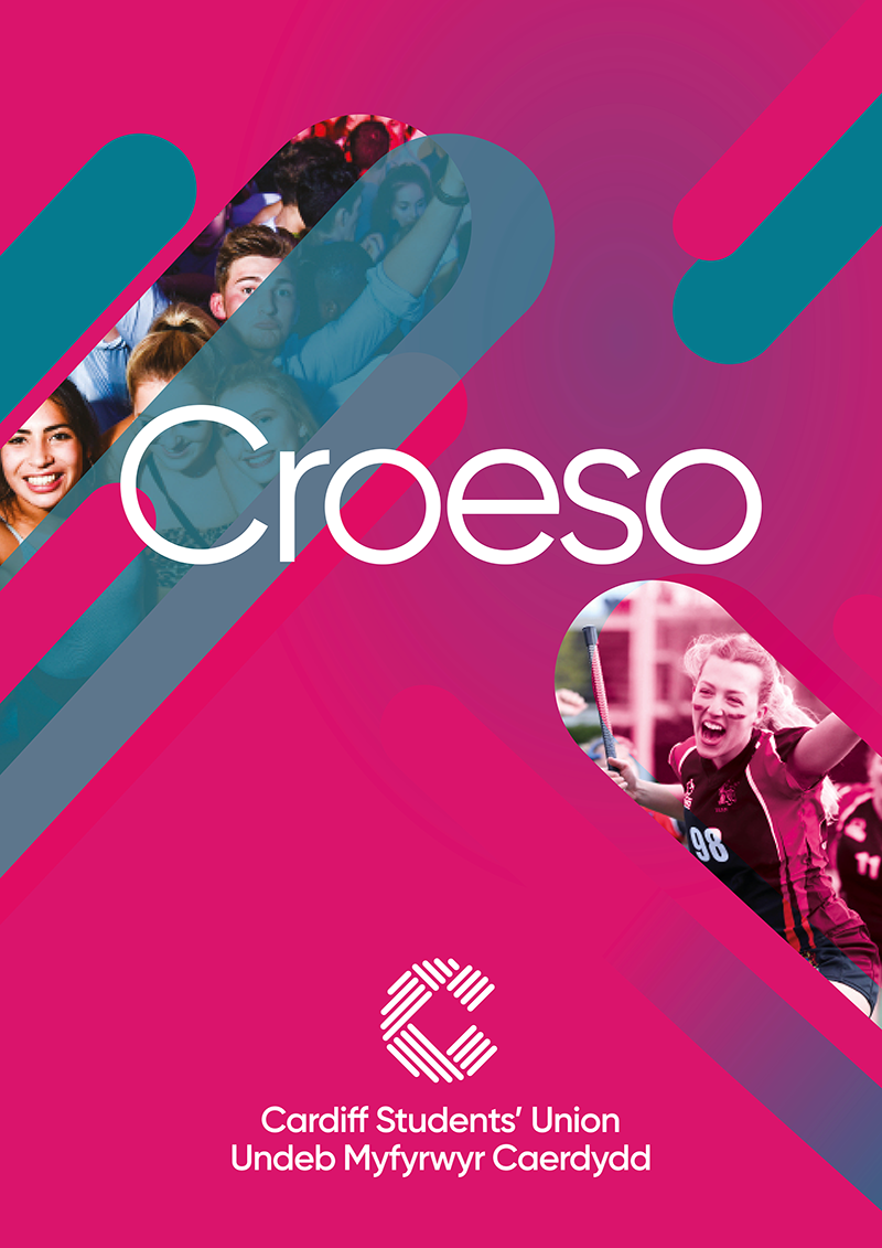
In the rebrand for Cardiff Students’ Union, I reframed the organisation around the lived reality of student life, its energy, diversity and constant motion. The concept was built on a simple idea: every strand of student experience weaves together to create the fabric of the Union.
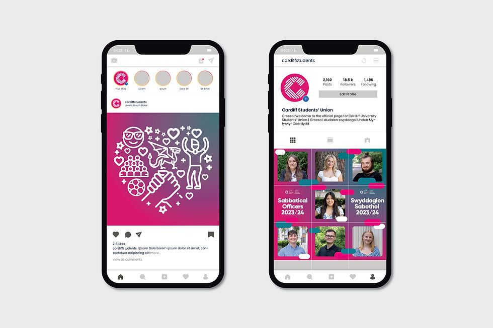
I developed an identity that visualises that connection. It's a bold design, using vibrant colours and a system flexible enough to represent every community, club and moment on campus. Rolled out across digital, print and environmental touchpoints, the rebrand became a unifying symbol that strengthened recognition and made the Union feel unmistakably student‑led.




Campaign Work
A brand that grows
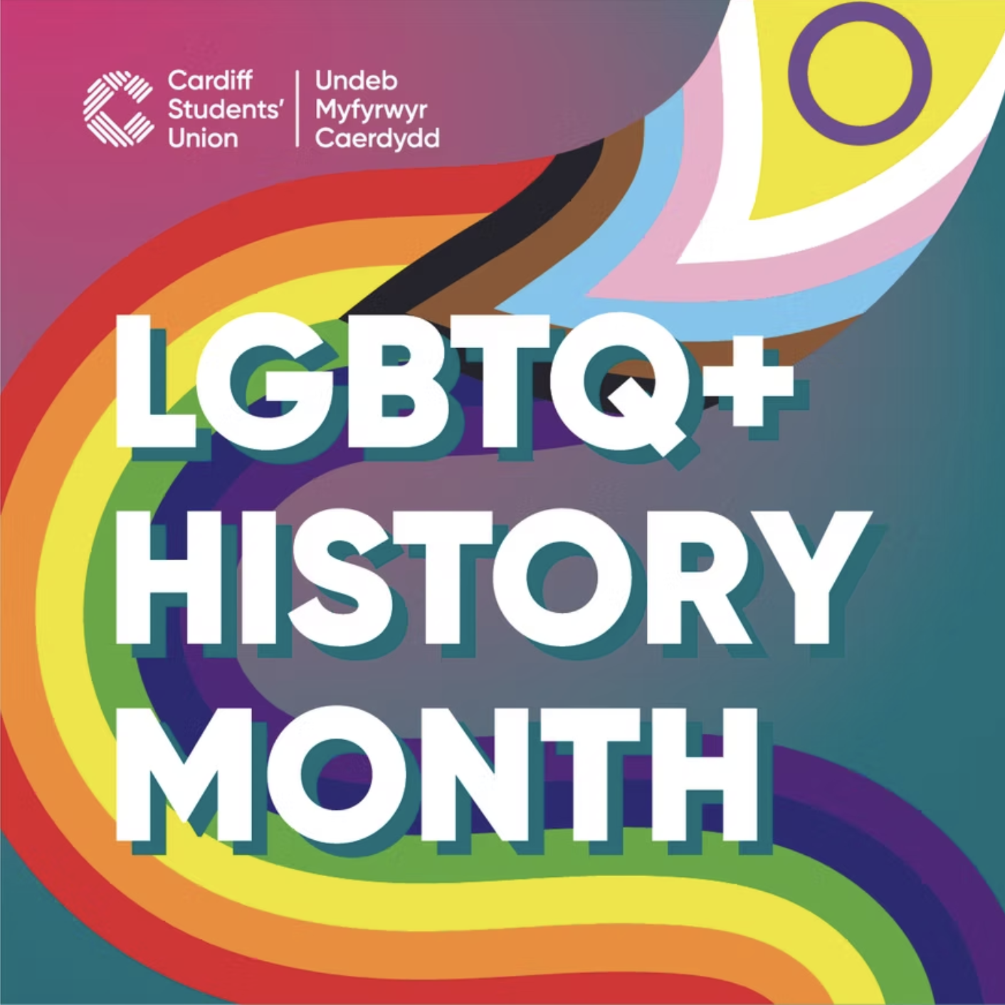
The strand motif at the heart of the logo becomes the engine of the wider identity, a system designed to grow, adapt and respond to new campaigns across the Union. Each strand can flex in scale, colour, and composition, allowing the brand to evolve without losing its core look and feel.
For campaign work, the strands can expand into expressive patterns, directional graphics or framing devices that guide messaging. This modular approach means the brand never feels static. Instead, it behaves like the Union itself: constantly shaped by the students. The result is a visual language that remains cohesive at its core while offering endless room for growth, storytelling and adaptation.